Open Law Design System and Rebrand
We acknowledge the Aboriginal people as the Traditional Owners of this land, and pay our respects to Elders past and present. Working from Darug and Gadigal land.
A scalable design system for Open Law, a BarNet non-profit initiative aiming to improve access to legal information through a collection of digital tools.
Contents
Special thanks
Thank you to the director of Open Law – Michael Green SC for the opportunity to work on this project. I would also like to thank Nick Clark who showed me the ropes to Tailwind, SASS and taught me so much about frontend development with immense patience.
1. The team
| Human | Role |
|---|---|
| The Open Law Team | The software development team are the ones who bring my designs to life. Can't do it without the team! |
| Me! | Lead Designer – Worked with pre-existing design collateral to create a unified design system across the Open Law ecosystem. Wrote comprehensive documentation on Confluence and Figma that promotes scalability and consistency. |
2. The brief
As the range of Open Law projects begin to expand, a cohesive design system is important for aesthetic, practical and usability reasons.
- Brand identity – sharing the same design language makes it clearer that the projects are all created by the Open Law initiative.
- Speed – creating a reusable component library in Figma and in a React component library makes designing UI layouts and building web pages much more speedier.
- Accessibility – colour variables labelled semantically in Figma makes it easier to have consistently WCAG AA-compliant colour combinations.
In the process of rebranding Open Law and its product offerings,we also want to ensure that the colours used pass the WCAG AA contrast ratio test, and that the brand re-imagining fits in with Open Law's mission and vision.
Open Law's Mission
To provide open access to legal information to enhance justice outcomes for all past, present and future generations.
Open Law's Vision
To be the leading legal informatics company that organises and provides the best legal information accessible to all.
3. Design process
Rebranding
Logos
The previous logos for Open Law, JADE, and the Victorian Reports had vastly differing design styles, making each product standalone from one another.
Our new strategy aims at bringing these products together to create a recognisable suite of products.
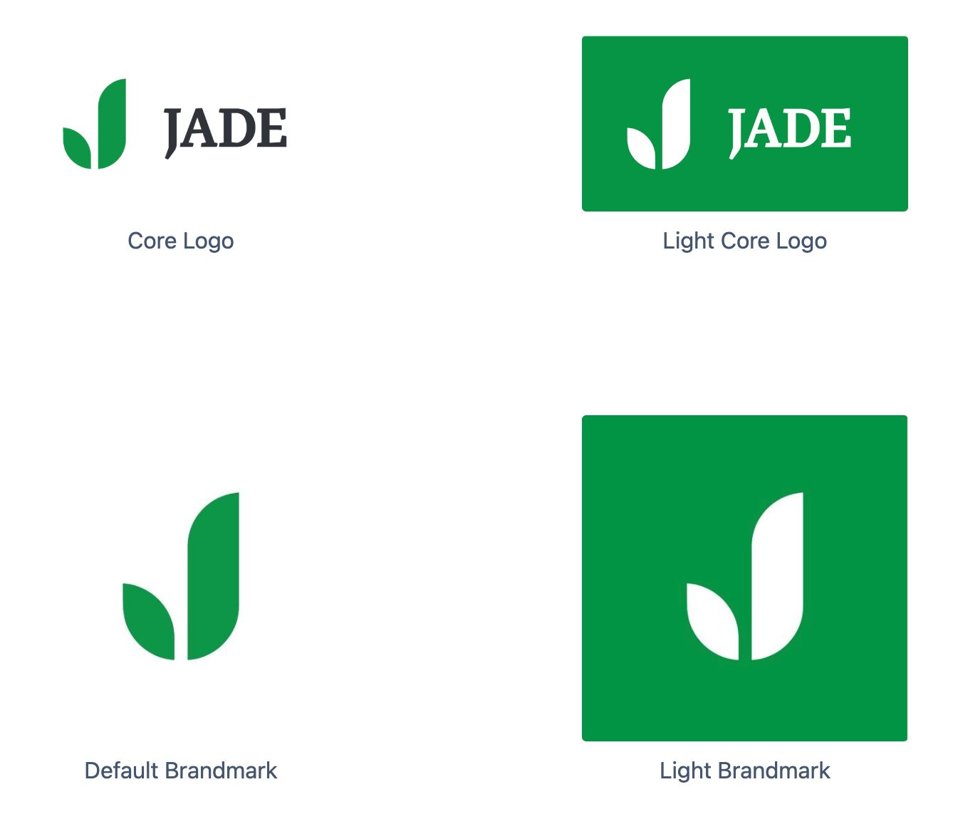
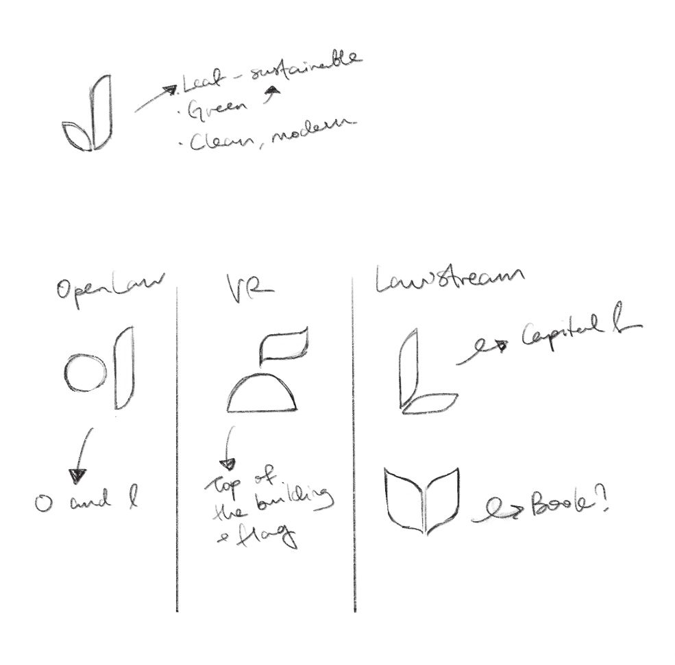
Since Open Law's most recognisable (and most used) project is JADE, I decided to base the redesigned logos on the pre-existing logomark. This is because the logomark already embodies the values of Open Law –– the leafy shapes signifying an opportunity to grow in legal knowledge. It is also recognisable as the flagship Open Law product.
Building upon pre-existing design materials and logos by Miriam Green, I set out on a journey to gather the infinity stones...
The first logo that received the overhaul was the JADE logo. A couple of changes were made:
- Typeface changed to Malaga for a more recognisable and modern feel
- "jade" converted to uppercase (JADE) since it's an acronym for Judgments And Decisions Enhanced
- Text changed from green to Open Law Black (#1A1A1A) for accessibility on white backgrounds
- Exports for logomark and inverted colour scheme created
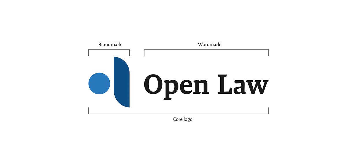
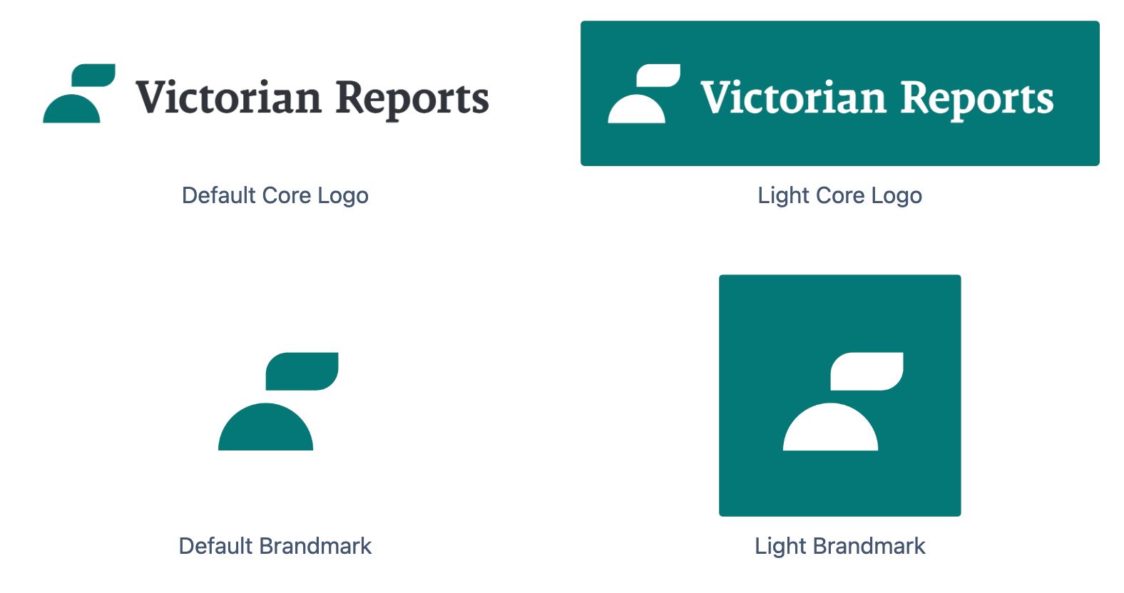
After the main JADE logo has been refreshed, I moved on to redesigning the logos for Open Law and Victorian Reports to have the same visual design language, while maintaining their previous colour schemes (for recognisability).
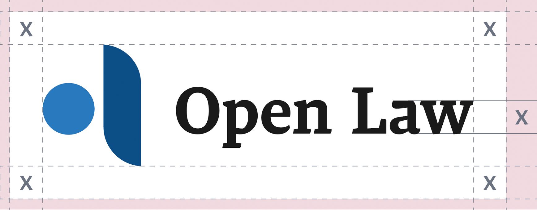
After redesigning the JADE, Open Law and Victorian Reports logos to be consistent, it set our team up for a more scalable logo design system which is both recognisable and functional as part of the Open Law identity. Each logo includes a logomark, brandmark and inverted variations.
Colours
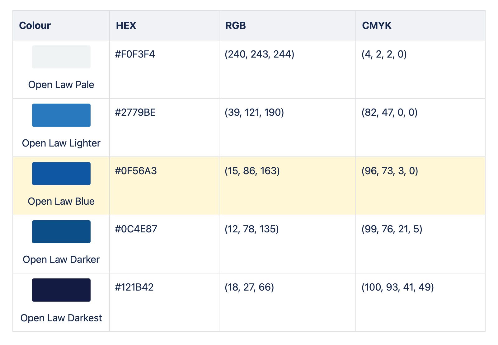
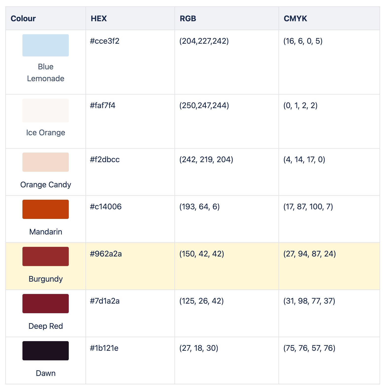
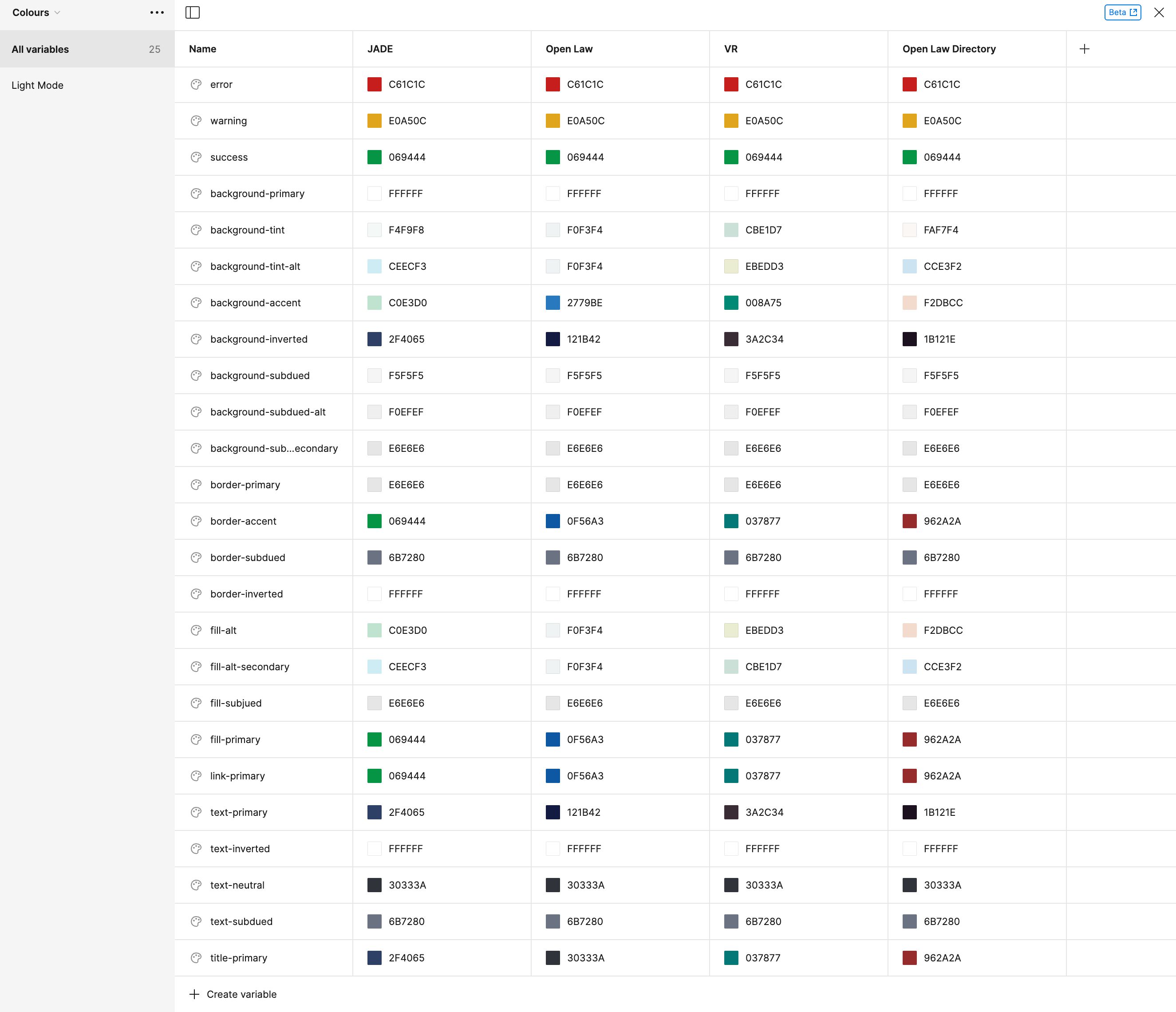
While there were already existing colour palettes for Open Law products, some colour palettes had too many variations which aren't used. I reduced the number of colours per palette to under seven for each product and consolidated the colours in a Confluence document. Future products would then be able to reference the colour scale (e.g. our upcoming Open Law Directory product uses orange).
Shapes
For our main brands: Open Law, JADE, and Victorian Reports, distinct shapes have also been assigned for marketing and design.
- Open Law: circles and open circles that resemble ripples, "a positive ripple effect"
- JADE: loose waves that convey a sense of calmness
- Victorian Reports bold stripes that mimic the stripes found on the spines of Victorian Reports physical printed books.
Constructing a figma component library
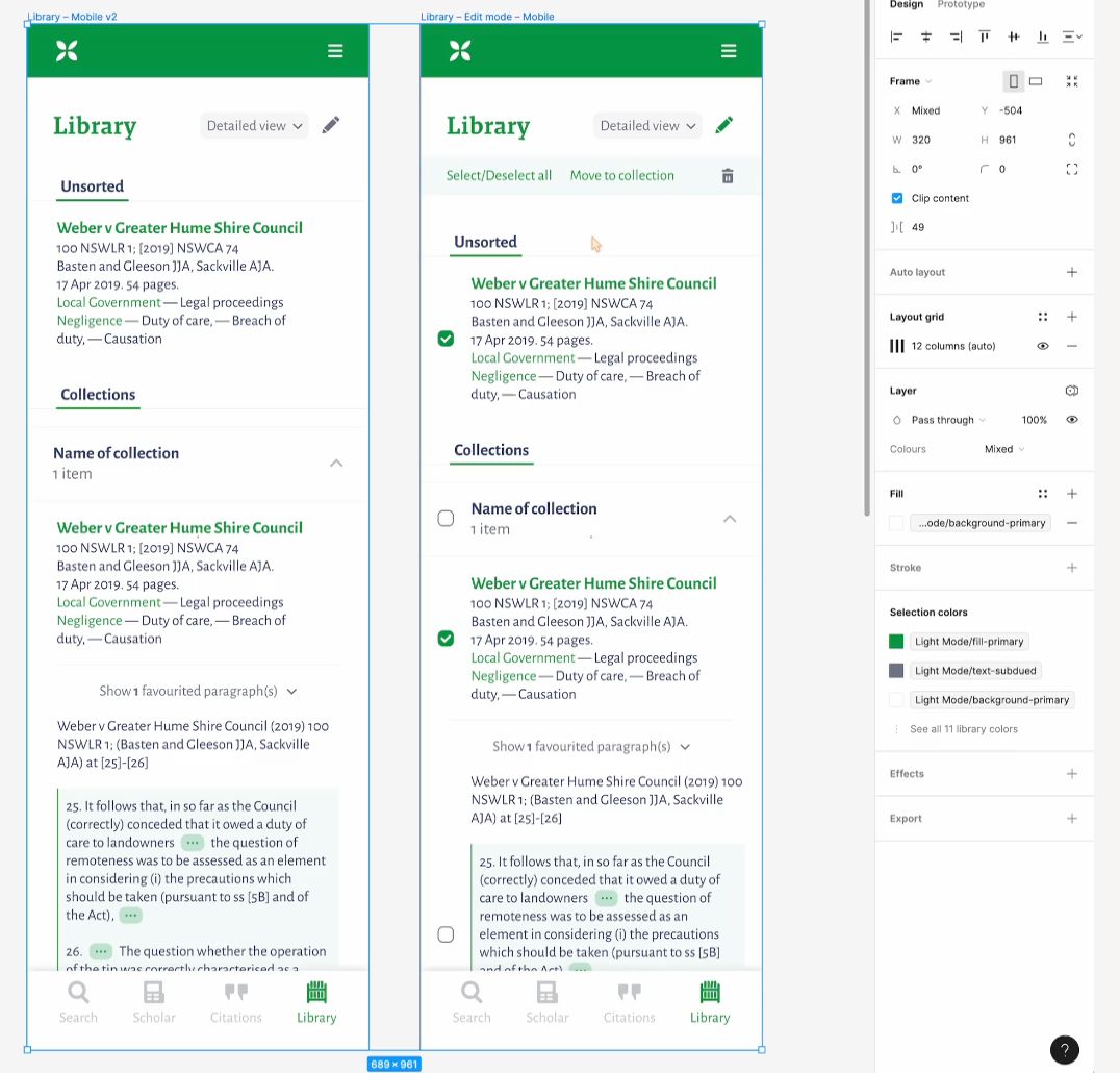
Now that the building blocks have been put in place, a Figma component library was built to make redesigning previous sites, and building new sites much more efficient and consistent.
Semantic colours
After Figma released its colour variables feature, I set out to refactor our existing colour style presets to become semantic colour variables. This meant that component colours can be easily switched out by brand using the "change variable mode" feature, rather than requiring multiple variations of the component to be made.
Typeface presets
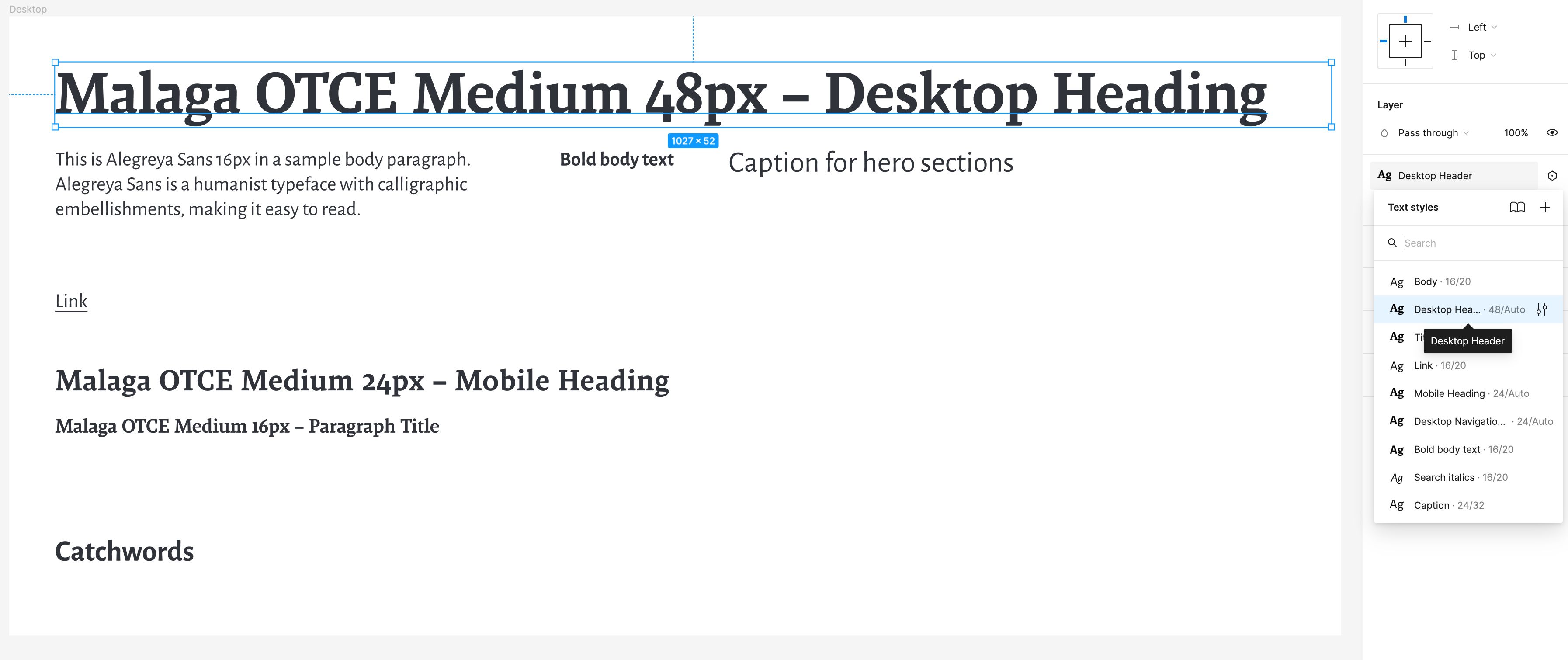
Across our in-house projects, we use the same typeface presets for headings and body text. To make UI design more convenient, Figma text styles have been created so updates can be made across the board more easily.
- Malaga OTCE Medium for headings and significant titles
- Alegreya Sans for paragraph titles, body and caption text
Icon library
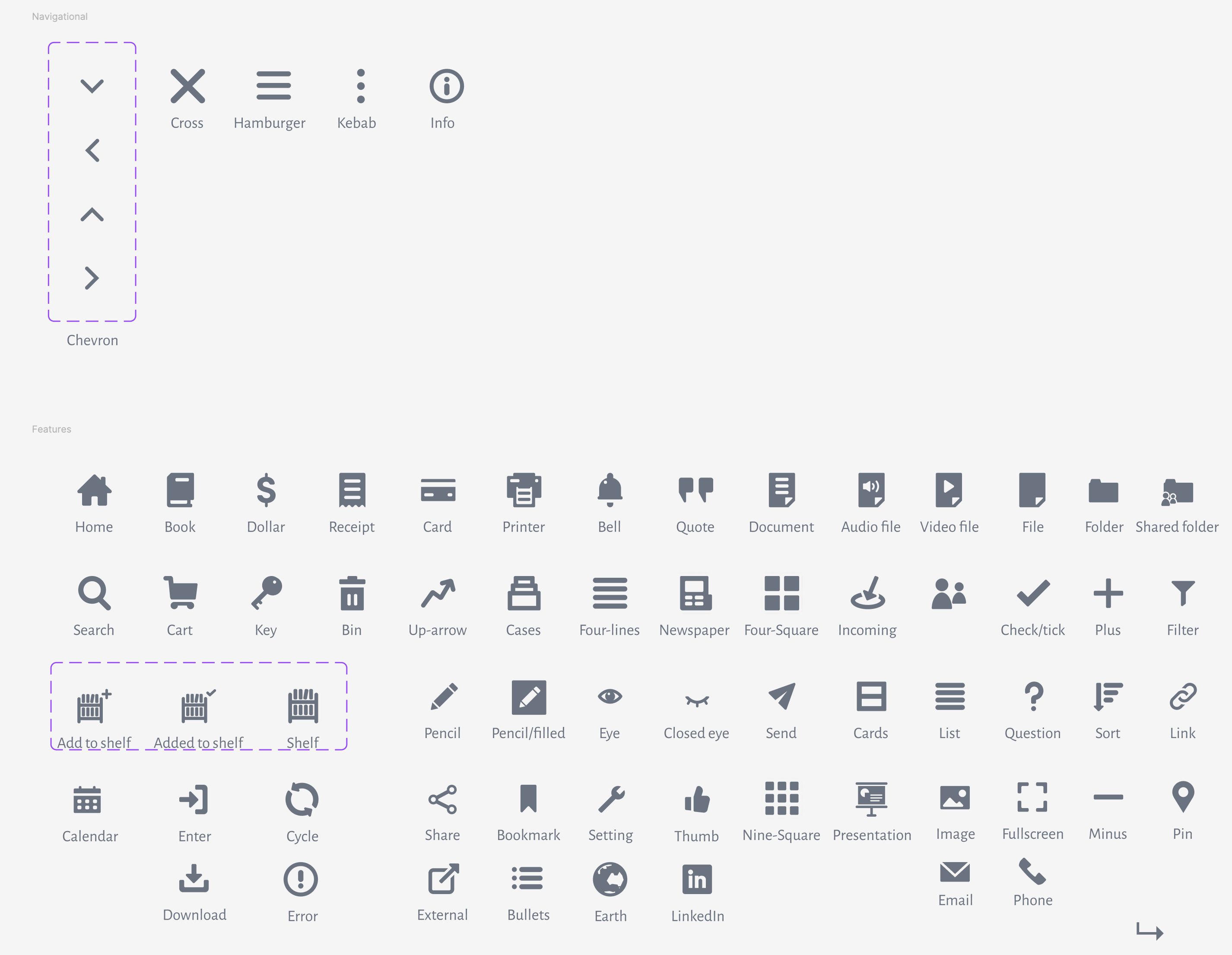
Some icons (such as the shelf) are unique to our offerings and have to be custom-made. Due to having icons that are unique to our offerings, an icon library is important for consistency.
Icons were designed in Figma with 1px radii where suitable, and at least 2px padding in a 32x32px canvas.
Thanks to Bob Chen, these icons have been made into a React component which we can use in code.
The icon library is constantly being updated as more icons are needed!
Reuseable components
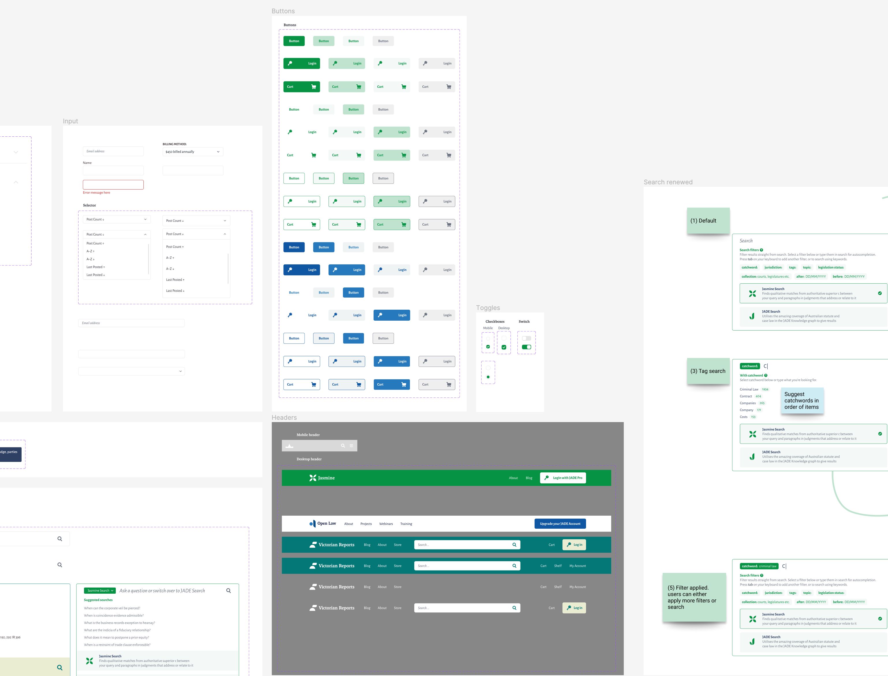
To speed things up for designing in Figma, I made some reusable components that can be placed like puzzle pieces in future projects.
These components have different use states and variations based on brand and mobile/desktop sizes.
Developing an illustration style
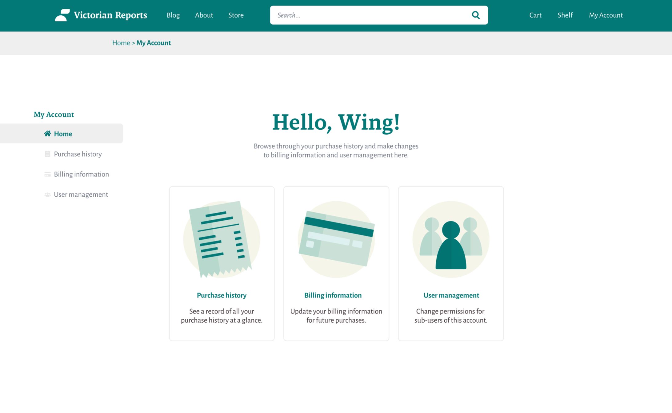
Illustrations can be used to elevate visual interest in product pages. I created an illustration guideline that uses colours from the colour palettes in the Colours section.
This is to make sure that they fit in with the rest of the look and feel of the site that they’re on. It also helps to promote brand consistency. In general, illustrations are very geometric in style.
There are a few types of illustrations:
- Product illustrations – for showing off product features – I've animated some of these as lotties for a product promotion page for JADE
- Spot illustrations – decorative illustrations to create visual interest, they can be considered larger cousins of icons
-
Promotional illustrations – more detailed illustrations with scenes used for marketing, usually thematic
-
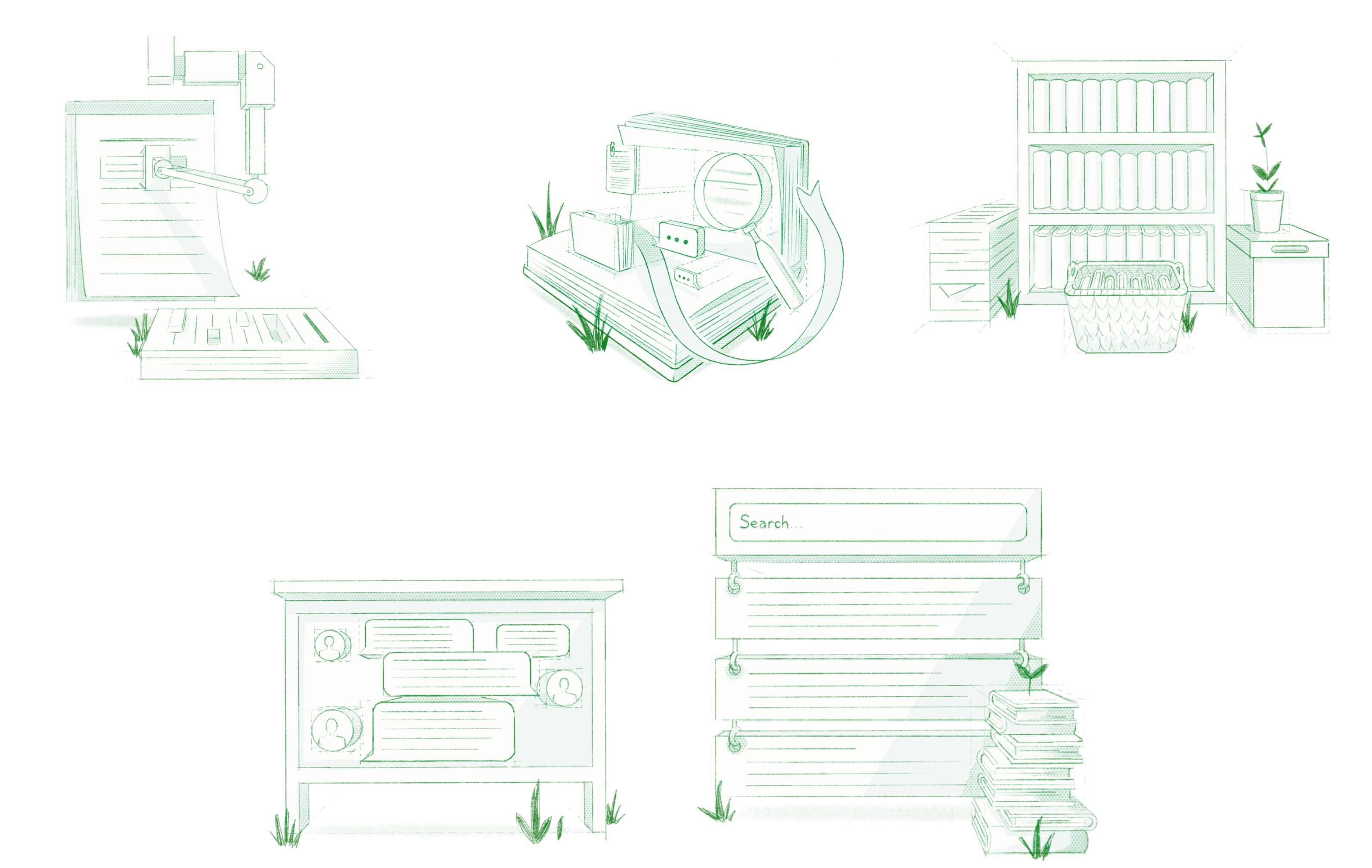
Sketch illustrations – an illustration style specifically for Jasmine which has a steampunk-esque feel to it; gives off the feeling of "bleeding-edge" technology since Jasmine is our AI semantic search engine
4. Challenges
A lot of work was done on the Open Law Design System and rebranding, and not without its challenges!
- Adapting to new software
Before I started working at BarNet Open Law, I've mainly used Adobe XD for UI prototyping. Adapting to features on Figma took some time, but it was a lot simpler to use for building reusable styles and components.
- Refactoring for new Figma features
In 2023, Figma released colour variables and modes, which meant that the component structure I built in 2022 had to be completely overhauled. Rather than creating multiple variations of components (e.g. buttons) with different named colours, colours had to be reassigned to be semantic in nature.
While refactoring the components took time, it was worth it in the end for the ease and speed in changing themes in future projects.
- Working from (almost) zero
Other than the original JADE logo and some of the colour palettes seen in the Rebranding section, all of the work in this document was completed by myself as the sole designer. Although it was challenging to complete, I'm grateful for the inputs of my colleagues in improving and iterating the design system.
5. Final comments
Working on the Open Law Design System and rebranding was one of the most rewarding projects I've done to date (as of 2024!). Seeing the impact that my work has on the organisation is very rewarding and I've learnt a lot along the way.
© 2024 BarNetwork Pty Limited (ABN 32 092 121 198) and Wing Pang
